Capturing those ethereal, wispy clouds seen at the end of walkies
Every painting or drawing has its challenges, but this one raised more questions than most. Let me tell you all about the dilemmas and decisions, fun and frustrations, tools and techniques that combined to create “End of Walkies”: my latest painting . . . or is it a drawing?? It could help and inspire your artwork.
Angela Birchall
12/7/202410 min read
This is a classic example of a scene that you really want to capture in an artwork but you have to work out which medium you need to use in order to recreate the effects that you saw in nature which sparked that enthusiasm in the first place.
It reminded me of the determined struggles that Impressionists like Monet went through in his efforts to capture the effects of light on various subjects at different times of the day. It also made me grateful that I have knowledge of and experience in using a whole variety of painting and drawing media so I could work through which ones would allow me to create which effects.
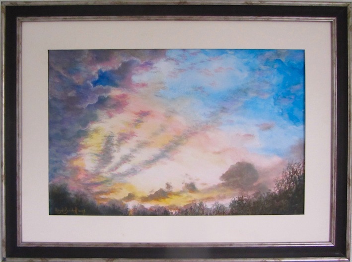
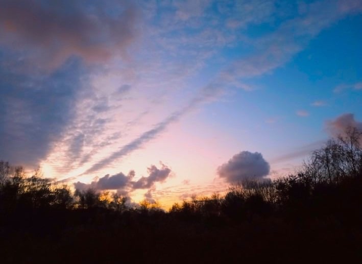
Let me explain the situation. I took this photograph as I was coming out the park at the end of a walk with my young Westie, hence its title “End of Walkies.”
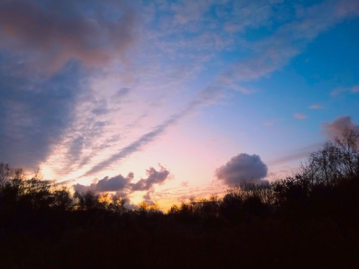
I looked back into the park while he was sniffing the last of the fence posts and I saw this scene and had to get a photo of it before it disappeared.
The colours of the sky were gorgeous, with the sun starting to fill the bottom left corner of the scene with warm sunset colours contrasting with the cool blues diagonally opposite in the top right corner. What really fascinated me, however, was the cloud formation. On the left they billowed up from the bottom left corner while the rest of the scene was filled with streaks of thin, wispy clouds fanning out across the sky from that left corner. The pinks and peaches of the setting sun were clipping the edges of the clouds and the whole scene was just screaming out to be painted . . . or drawn.
I took a few photos and we came home. A few weeks later I decided that I really wanted to turn it from some photos and a happy memory into an artwork.
I looked at the photos; I recalled the subtly changing light effects across the sky as it slowly, imperceptibly, swung from warm oranges, through peach and pinks into the bright blue. Those pinks and blues combine to create the purple shadow colours on the clouds. Oh those clouds! To me they were the most important element that I needed to recreate to capture the I effects that wanted from this artwork.
So how was I going to create the range of sky colours and then portray those little wispy clouds on top? That was my dilemma.
I work mainly in five different media: painting in acrylics, watercolours or oils, and drawing in pastel (soft, chalk and oil) and pencil, so it was going to be one of them.
I did think of Monet’s famous “La Gare Saint-Lazare” paintings where he was trying to capture light on clouds of smoke and steam billowing out from the trains in the station. He would have used oil paints but I knew that both oils and acrylics would not make it easy to capture those delightfully ethereal wispy clouds that I loved so much in the scene. Pencil was also ruled out quickly because of the colours that I wanted.
That left watercolours and pastel. Without doubt, watercolours would let me create the sky colours as the warm tones gradually melt into the cool blue shades, especially if I used the wet-on-wet technique.
Wet-on-wet in watercolours
The ‘wet-on-wet’ technique is a bit like it says on the tin: instead of putting wet paint on a dry paper/surface, you wet the area of the paper that you want to colour and you drop brushes full of the wet paint into it. It’s a fun but challenging technique, and one that you need to be prepared to play with as a range outcomes and effects emerge.
As wet meets wet they merge and bleed into one another. To start with, the colour you have just put on meets the clear water and, as it merges and spreads, it becomes paler as the proportion of pigment reduces in favour of the proportion of clear water. You can, of course, strengthen the colour by adding more wet paint, but the more paint you add the more liquid there is sliding round the page doing its own thing with you trying to persuade it to do something that achieves a good outcome.
Then, if the wet colour you have added meets a second wet colour, they will start to bleed and merge and become a third colour creating a variety of hues depending on how much of each of those pigments there are in the mix/merge. Thus, you also need an understanding of colour mixing if you want to have any sort of control over the outcome.
You don’t have to just stand there and watch the merging and creating of colours and patterns, you can play around with creating different effects. For a start, you can tilt the board up and down and side to side and let gravity play its part in the process as you watch for the merging colours to hit the right note and hope you can stop the flow at just the right point. You can dab out some of the moisture and/or the colour, especially if you have been rather generous or over-enthusiastic with the liquid levels!
It’s almost a case of doing anything with the paint except the instinctive thing of reaching for a brush to manipulate the colours. You could use a brush – there are no hard and fast rules as to how you do wet-on-wet – but the beauty of it is in not seeing any brushstrokes.
I started this painting by wetting the entire area other than the section of the silhouette trees and bushes and the top corner where the strongest blue is. Then I mixed a peachy/orange colour and started dropping it in just above the treeline and to the left of the paper.
Pink and blue create purple clouds
As the image goes towards the centre, it goes from peach to pinks and then takes on purple hues as it goes towards the top right which has that strong blue. That makes sense because pink and blue make purple, and I knew that I didn’t want that warm orange colour at the base creeping up into the blue because it would have turned it a mucky brown instead of pretty purple.
I let most of the moisture in the warm section of the sky dry off, especially the orange/peach colours. Then I wet the top right section where the blue was going, allowing it to come down to the treeline on the right and across to the top left. I flooded it with a blue that is actually a favourite of mine for bright sunny, middle of the day, skies. I did actually put so much moisture on it that the paint was swirling round as I tilted the board up and down and side to side. I remember having great fun seeing the colours swirling round and they were giving that impression of the direction in which those wispy clouds were going to be racing across the sky.
When it came to the left side of the painting, I knew that I wanted the blue to merge with the pinks to give the impression of that solid bank of cloud billowing up from the bottom corner. I kept the blue as the dominant partner in the background clouds but right up in the top left there were some fluffy, but quite thick, clouds that were catching the oranges of the sunset and that would have to be done later.
I left the blue sky section to dry and, because the orange colours at the bottom of the sky were dry enough, I killed off the remaining white paper with a dark colour as the base for the silhouette trees. When you are looking at the colour balance of each shade you are creating and applying, it can throw you if what is going to become the darkest section of the picture is currently the brightest section, so I like to block out the white sections as soon as possible.
So many people automatically think that you paint the silhouette in black. Noooooooo!!!!! Monet would turn in his grave if you did that!!! It may have some black in it, but it’s primarily the darkest blue and the darkest brown that you have in your paint collection mixed together in varying proportions so that you can dab in the suggestions of trees and shrubs with a bit of light and shade variations within it.
Oh those glorious clouds! Why didn’t I do the picture in pastels?
It wasn’t the final iteration of the treeline because the tips of the trees had to be painted last as they are the closest thing to the viewer, i.e. in front of those glorious clouds. Yes, those clouds which, to me, were the most exciting part of the painting and which I knew that I wouldn’t be able to do justice to using watercolours.
That was the point at which I thought: I really should have drawn it in soft pastel because I could have created those soft-edged, fluffy, wisps of clouds along with the pale highlights edging the thicker clouds as they reflected the colours of the setting sun.
I put the painting away and came back to it a few days later.
The more I looked at the painting and then back to the original photos, then more I realised that I loved the sky colours that the wet-on-wet had created, but watercolours were not going to give me the cloud effects that I could picture in my mind’s eye. But I was sure that soft pastels would.
I am not against mixed media but I realised that in all the decades I have been painting in watercolours and drawing with pastels, I have never drawn in pastel on top of watercolour.
Well, there’s a first time for everything and this was that first time.
Getting a selection of soft pastels in greys, pinks, purples, blues, oranges, tan, brown and white I started drawing in the clouds. As I was now doing mixed media I also mixed the pastels using both soft pastels and chalk pastels.
At this point I was using the shapes from the photos as a general guideline, i.e. big, billowing clouds coming up from bottom left, and thin, wispy clouds fanning out across the whole picture, with a few ‘blobs’ of more substantial clouds just above the treeline. At the same time, I was using the patterns created by the swirling wet-on-wet colours to make some of those cloud shapes, especially the billowing ones on the left.
The importance of light and shade
I’m always reminding my students of the importance of light and shade in order to create a 3D feel to whatever they are drawing or painting, and with these clouds it was crucial. There’s also an interesting changeover in the colours of those wispy clouds depending on what the background sky colour is behind them.
Look closely at the photo and the darkest part of those long lines of wispy clouds appears to be so much darker over the lightest of the sky colours (bottom left) than they are in the bluest section of the sky (top right) so that needed a subtle shift in the colours of the pastels as the clouds fanned out.
Because the light source is the setting sun and, therefore, the direction of light is coming up from around a third of the way across the horizon from the left, all the touches of light hitting the edges of any of the clouds had to follow that direction. Thus, the clouds in the top left of the scene have highlights on the right and shadows on the left, while the clouds on the right reverse this with highlights on the left and shadows on the right and all lighting coming from underneath rather than the usual top down direction of the sun in a landscape.


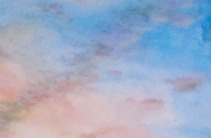

I had a great time creating those columns of wispy clouds from the photo (left) especially as the pastel can be dragged, dabbed and smudged out to create those fine wisps in my painting/drawing (right).
Then I moved to the billowing clouds on the left. I used the colours and shapes from the watercolours as the basis of the clouds and mostly just used the pastels to create the edges where the setting sun clips them with more delicate colours. Because I mostly used the shapes created by the original layer of paint to dictate the final formations, it deviates from the original photos, but I loved the effects of the light pastel shades on the edges contrasting with the darker colours of the denser clouds.


With the clouds completed, I still had to do the finishing touches for the silhouette treeline, so it was back to watercolours and that ultra-dark shade of darkest blue, darkest brown and a bit of black.
A final dilemma
With the picture finished I was puzzling over what you call a part-painting and part-drawing when another question sprang to mind. As I had never used pastel on top of watercolour, I also had no idea what would happen to the watercolour when the moisture from the pastel fixative landed on it. Would it re-activate the paint? Would it give a mottled effect from the droplets?
Imagine getting the picture finished and then ruining it with fixative!!
I went back to my files and chose a demonstration painting in watercolour that I had used with a class. I merrily sprayed that with fixative and left it to dry. A few hours later I confirmed that no damage had been done so I added fixative to “End of Walkies” and framed it ready for exhibition and sale.

Remember, if you have an arty question that you want to ask, just message me using the box below and I can include it in a future blog.
Get in touch
Use the message box to drop me a line if you want to:
purchase my paintings or drawings;
discuss commissioning me to create a unique work of art especially for you;
have a question to be answered in a future Picture Perfect blog post;
join one of my face-to-face painting or drawing classes in West Lancashire or have private coaching online;
discuss a bespoke staff development event using art to encourage teamwork and leadership
Contacts
0044 77242 00779
youcandrawandpaint@gmail.com