Joining the dots to lead the viewer round your painting
In Part 2 of 'Basic Composition' I want to show you how to use S-shapes and curves to 'join the dots' and take the viewer on a journey that links the various elements within a picture
Angela Birchall
9/29/20257 min read
In Part 1 of 'Basic Composition' I spoke about using the “rule of thirds” to place the main elements of a painting or drawing into the picture plane.
Instead of having the main focus of the painting smack in the middle, we move it towards, or on, one of the 4 third lines. These are the 2 horizontal or 2 vertical third lines, and I often use the junction of a horizontal and vertical line as a key positioning point.
In a landscape, the distant horizon is often on the top horizontal third line leaving the top third section to be filled with sky. That can also have an overhanging tree at the top of the picture plane to act as a frame for the image itself. Then we start the foreground on the bottom third line and continue it down to the bottom of the canvas. That leaves us with the middle third section for, unsurprisingly, the mid-ground in the picture.
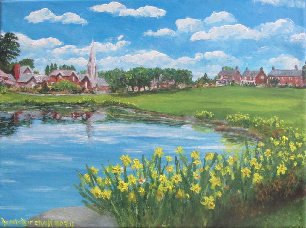
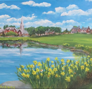
Even this example of Springtime in Wrea Green, Lancashire (below), which doesn’t have a vast distance in the background, fits the three sections: sky in top third; skyline on top horizontal third; mid-ground of village green in the middle third; ending with the bottom third filled with daffodils surrounding the front edge of the lake.
That is a very simplified explanation and the divisions are not so flat that the look like they have been drawn with a ruler! The distant horizon is frequently sloping hills or mountains and the foreground also has sloping ground or foliage that breaks it up from being too flat. Generally the flattest line in a landscape is something like the edge of a lake or a man-made construction like a wall.
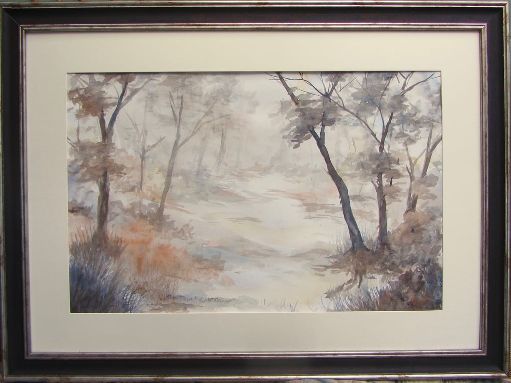
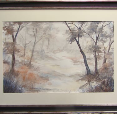
The other element that breaks up those triple layers of sky, mid-ground and foreground, are the strong verticals that we also look for to place around those vertical third lines. The obvious strong verticals in landscapes are trees as in my painting (below) of Woodland Wander, but they can also be natural elements like rock formations, or man-made things like walls, archways, etc.
While I have only spoken about landscapes, the principles are the same for cityscapes (more chance of strong verticals there), for still life (arrange the fruit, flowers, vase, etc on those third lines and don’t have the vase or bowl of fruit right in the centre) or portraits (the head off centre and eyes on the top horizontal third line).
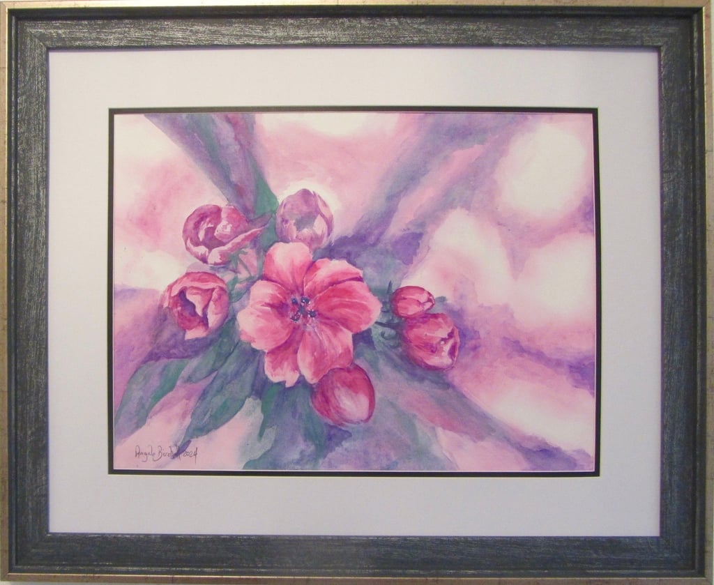
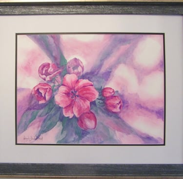
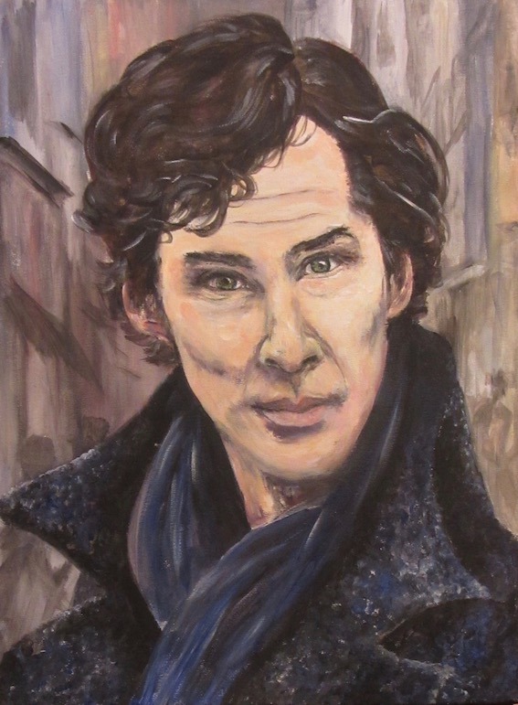
In my painting (below) of hellebores, the left side and bottom of the main flower sits on the junction of those two third lines, while in the portrait of Benedict Cumberbatch I have positioned his very dark, piercing eyes on the top third line, the archetypal high collar is going up the right vertical third line, and the left collar point and base of neck takes you along the bottom third line..
JOINING UP THE DOTS
Placing elements in the picture around the third lines and sections is only the start to creating a great composition. You want the viewer to go all round the painting or drawing in a smooth, flowing movement, not just jumping from one point to another. Therefore, you need elements in your design that join up the dots.
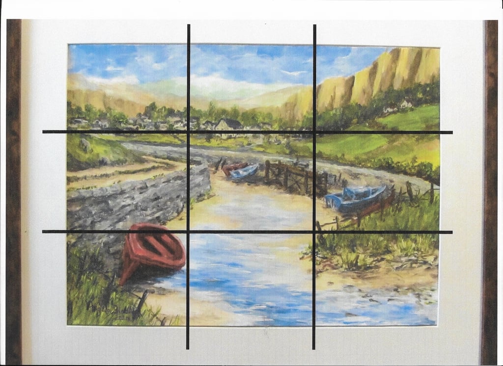
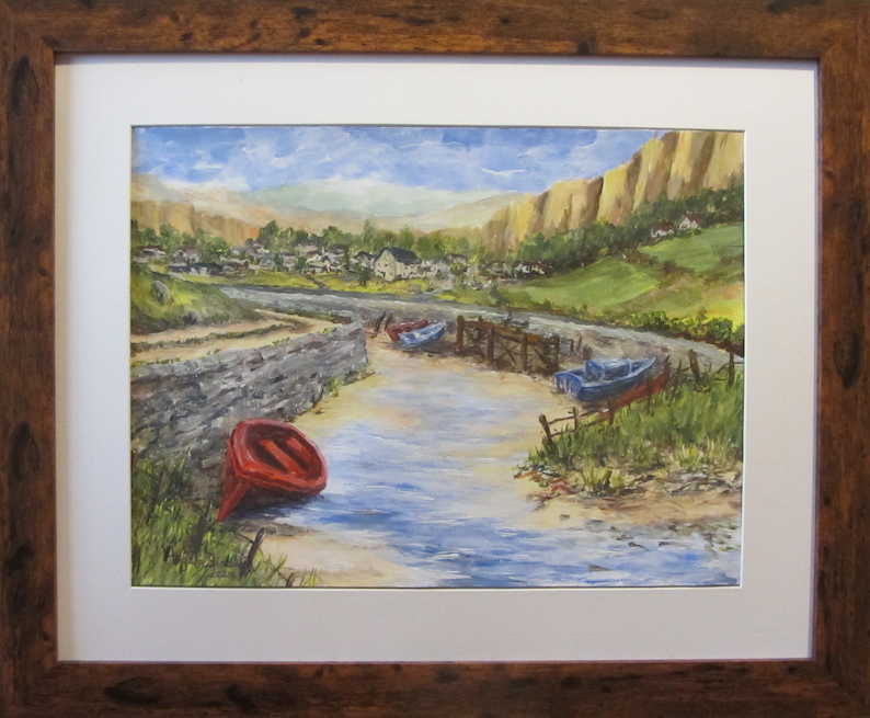
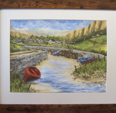
Take this painting as an example. The village in the distance sits on the top horizontal third line; the middle section has all the mid-ground elements; while the lower third section has the trickle of water and the beached vessel that gives the painting its title of “Fishing boats at low tide”.
I also placed the red boat which is both the closest boat (thus the biggest) and the brightest colour to attract your eye, right on the junction of those third lines on the left. Meanwhile, the right side junction is where the sloping sand dune comes down to the water’s edge.
But how do we join up the dots with all these placed items?
The ideal shapes to play around with are S-shapes which wind and weave their way through the picture linking all the main elements and giving your eye an easy way to travel right the way round the scene.
When planning the painting I am trying to take the viewer on that complete journey, so I take advantage of any naturally occurring bends and twists, especially in paths, roads, rivers, bridges and tree branches. Once you have main pieces of the picture placed around the third lines then you almost link those elements up with the S shapes – a pathway through the trees to take the viewer into the scene with slopes in the middle distance edged with hedgerows that define the curve of the hillsides and take the eye upwards to where maybe overarching branches of a tree takes your eye from one side to the other before bringing you back down to earth via the strong horizontal line of the foreground tree on the third line, at the bottom of which is the path from where you started your journey round the picture.
Sometimes these S-shapes are elongated, sometimes contracted, sometimes they have multiple curves back and forth or there are multiple S-shapes in the one painting. “Fishing boats at low tide” is a classic example.
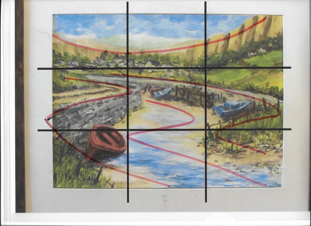
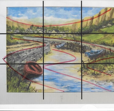
If you start your journey with the red boat then go up to the road on top of the wall, both of which use the S-shape leading you to the start of the village. That starts with a flat line but it sweeps up the hillside taking you to the top of the mountains on the far right before sweeping down to the left edge, rolling back to the cluster of trees behind the village. From there you can take the top road that goes from left to right through the centre of the painting curving round and down that sand dune, taking in the blue boat, coming down the fenceline to where the dune becomes beach. From there the bright blue of the water takes you on another S-shape into the centre of the painting . . . your journey right round the painting is complete.
The S-shapes can be achieved through use of light and shade – as you can see in the next example.
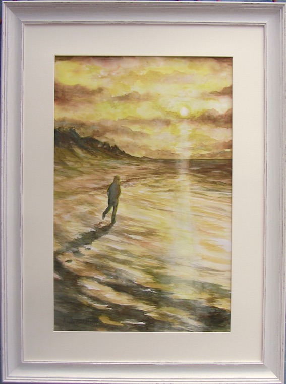
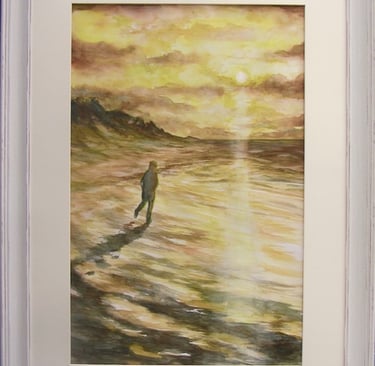
In this painting, Sunset Stroll on Southport Sands, I use the figure and the reflected setting sun as vertical thirds left and right; the horizon is near the top horizontal third while the shadows on the bottom section are in the lower horizontal third. The viewer can start with the dark figure in near silhouette which is heading in the direction of the setting sun so that takes the eye up the column of white light to the cloud patterns. Those clouds give me the start of the flow back and forth across the picture plane coming down to the dark shades on the sand dunes going to the flat horizon on the top third. Those dark shades curve from right to left coming into the shadows on the waves. The wave patterns then weave back and forth just as the eye went back and forth over the clouds.
Of course you can do it in reverse and start with the figure, come down the column of light to the strong dark and light of the waves and weave your way up the painting.
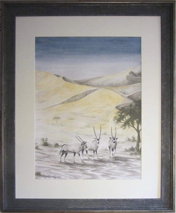
Another example where I have used light and shade to create the S-shapes is this scene of a trio of Gemsbok at dawn in the Kalahari Desert.
I wanted to depict that fleeting point in the day as the midnight blue sky gives way to the blazing heat of a cloudless sky in a typical desert day, taking me back to my childhood years in that part of the world.
I deliberately chose to work mainly in tinted charcoal so that the blues, greys and browns had the cool colours of the disappearing night. Then I added the touch of yellow gold shades in watercolours for the arriving sun to just start lighting up the tops of the sand dunes.
Once again, the curves of the sand dunes lead your eye around the painting in more of a figure of 8 Start with the gemsbok on the bottom loop of the 8, go to the right then up the tree at the side, onto the main dune’s ridge going diagonally up to the top left of the scene, across the skyline, dropping down to the dunes on the right, then diagonally back down the ‘gash’ of shadow in the main dune, and down and round to the gemsbok from where we started the journey. Of course, the patterns on the ground in front of the Gemsbok give an endless set of S-shapes for the eye to wander around.
That’s a somewhat simplified version of basic composition but as you see it in practice in both your own work and looking at other artists’ work you will develop a much deeper understanding of the nuances of the process.
It will also make you much more aware of placement of objects when you are taking photographs, and even more aware of the fact that when we are painting we can easily move a tree in the picture a bit further to the left or right to improve the composition, or lose a building, move a wall, add a few rocks – all the things that you cannot do when taking photographs of the scene!!
If you didn’t read the first part of “What goes where, and why? Starting to compose your painting” the link is https://www.youcandrawandpaint.com/what-goes-where-and-why-starting-to-compose-your-painting
Remember, if you have an art question that would make a good topic for a blog, just drop me a line with your idea and I will use it as soon as I can.
Get in touch
Use the message box to drop me a line if you want to:
purchase my paintings or drawings;
discuss commissioning me to create a unique work of art especially for you;
have a question to be answered in a future Picture Perfect blog post;
join one of my face-to-face painting or drawing classes in West Lancashire or have private coaching online;
discuss a bespoke staff development event using art to encourage teamwork and leadership
Contacts
0044 77242 00779
youcandrawandpaint@gmail.com