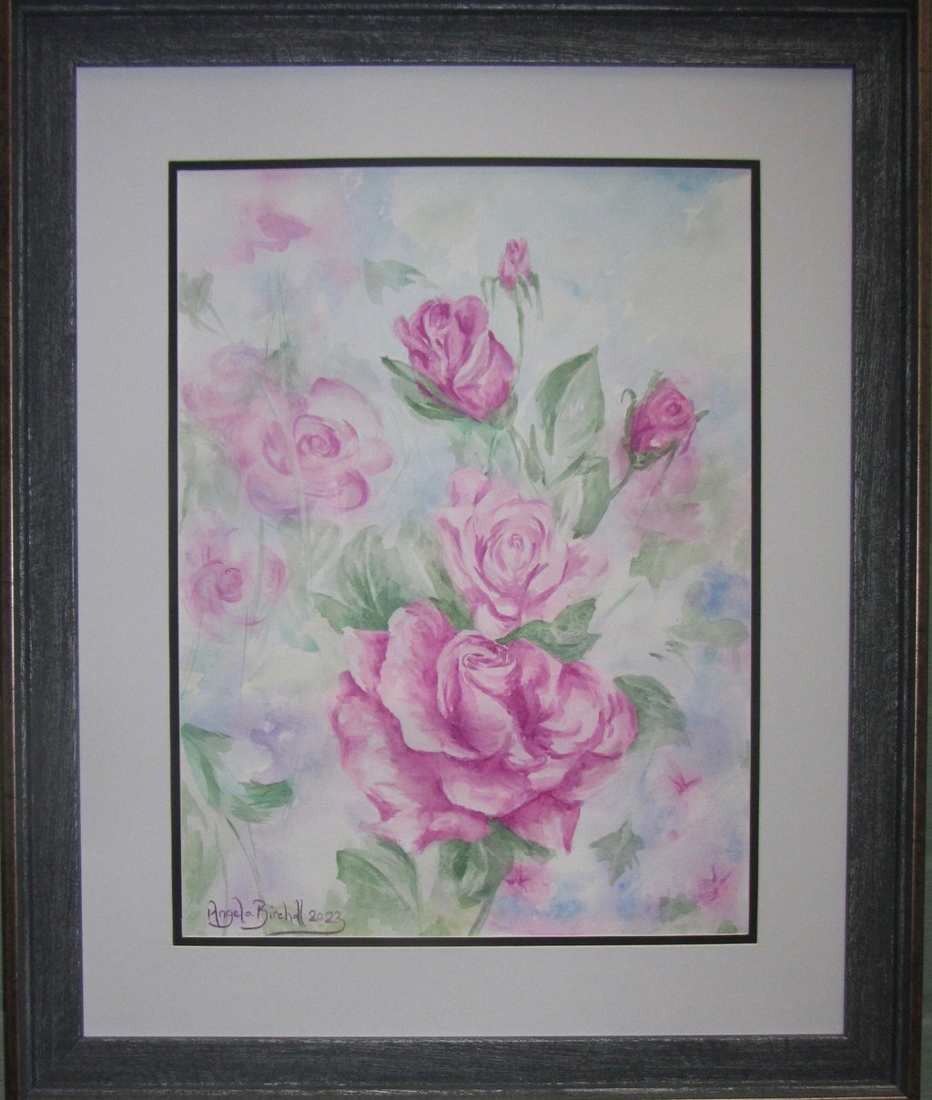
Purple baboon amid pink roses
There I was painting delicate floral shapes to act as a backdrop for a spray of pink roses when suddenly I realised that a purple baboon was looking back at me from the picture! I admit that this is not an everyday occurrence so I thought I’d tell you the story about how he came to be, explain about the techniques that I used for painting both these rose pictures, as well as the choices made for their composition.
PICTURE PERFECT: ARTWORKS AND EXHIBITIONS
Angela Birchall
9/29/20237 min read

There I was painting delicate floral shapes to act as a backdrop for a spray of pink roses when suddenly I realised that a purple baboon was looking back at me!
I admit that such things don’t happen every day but it’s one of those Bob Ross “happy accidents” which you only notice if you are working in the right hemisphere of your brain.
Artists use the right hemisphere to “see” things that are there in much more detail than the left hemisphere would see them, but it also allows you to “see” things that aren’t really there . . . you know what I mean when you look up at the clouds and you “see” a poodle lying on its back playing ball and a few seconds later it’s morphed into a polar bear! Well, I looked at my flower picture and there was a purple baboon shouting out at me.
I had been demonstrating how to use the wet-on-wet technique with some of my art students and was exploring the soft and subtle colours and patterns that can be created using wet watercolour paint being dropped onto areas of wet paper. The idea was to create a painting of roses that were in sharp focus fading off into suggestions of flowers of a similar colour palette.
I had done the initial drawing of the flowers that were to be in sharp focus as the centre of attention for this scene of pink roses. Keeping those areas bone dry, I started to liberally wet the paper surrounding them. As there was quite an expanse, I worked roughly in four quarters knowing that by the time I had worked around the page and done all four quarters of the background, the roses that were touching the first quarter would probably be dry enough to start painting them.
Anyway, as I said, I was demonstrating the technique to some of my students. You wet the page – or the area that you want to work in – and then, getting some very liquid watercolour paint, you drop blobs of it onto the wet areas. In this case I was using the magenta pink that was going to be the colour of the main roses, plus my favourite amethyst purple and a blue-hued green that would go nicely with the pink and purple.
As you drop the blobs of paint in, you don’t brush it in as you would do on dry paper but you let the moisture on the paper spread the colours out and perhaps blend with other blobs of the different colours you are using. You can let gravity help you by lifting up the paper and letting it run down the paper into other areas of colour. Unless you have absolutely flooded the page, the paints will just run and merge and blend and bleed into the areas that you wet first of all, and they will not go anywhere near the areas that you want to keep dry to create your sharp focus roses.
After I had demonstrated a couple of sections of this painting’s background using wet-on-wet, the students went back to start their own paintings. Once they were working away I returned to complete the background on my rose painting and began working on the bottom left corner. I focused mainly on the purple and the greens and dropped the colours onto the wet paper, tipped it up and down and watched as the soft hues merged. Then I saw it! Looking just like he was shouting out at me, a purple baboon had emerged from the foliage!
I remember calling out: “Look! I’ve got a purple baboon!” Not surprisingly, the students immediately jumped up and came to have a look and they all saw the same thing: a purple baboon!
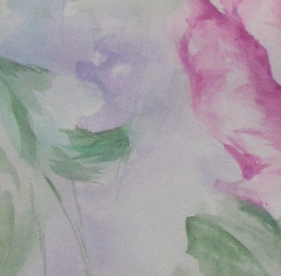
I could have easily brushed him out or turned him into a purple flower but once I’d seen him I was determined he was going to stay despite the fact that you don’t normally find baboons hiding in the rose bushes, let alone one that is half the size of a rose flower and purple!
With the wet-on-wet technique, if you want to add lines or areas that have a sharper edge to them onto parts that you have painted wet-on-wet then you have to leave that area to dry off completely. Then you also want to brush the paint straight on and not rub away with a brush. If you do rub it, all that happens is that you will activate the first layer and it will all start to merge with each other. That all too often ends up with a single muddy layer.
I did go over some of the wet-on-wet areas and enhance some of the pink flowers on the top left side and add some centres to the three little pink flowers in the bottom right section.
When it came to painting in the main roses, I used the particular quality that watercolours have whereby you can get a pale version, a very dark version and a whole range of shades in between all from the single colour. All you have to do is layer the colours painting from light to dark. If you were using acrylics or oils, you would have to add white to create pale shades and either black, dark grey or a very deep blue to create the darkest shadow shades.
Thus, I put a first layer of magenta over the whole area of the roses with a thin layer of colour wash – it’s so thin (i.e. the proportion of pigment is very low compared to the amount of water) that I could still see the faint pencil marks from the initial drawing. Once that was dry, I put another layer of the same colour on the roses just leaving out the parts of the petals that have the strongest highlights so that they look almost white. With each layer that goes on I leave more and more areas untouched so it is only the areas that I want to get a deeper shadow tone on that get painted in the final stages. With every layer I also ensure that the brushstrokes follow the direction of the curves of the petals so that they look more realistic.
The deepest shadows are also generally underneath the parts of the petals with the strongest highlights which gives it a 3D quality – it is a matter of playing with light and shade to create strong contrasts in the eye, otherwise known as “chiaroscuro” a technique of which Leonardo da Vinci was a maestro.
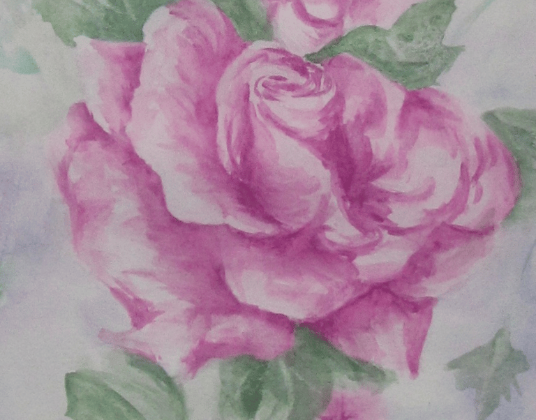
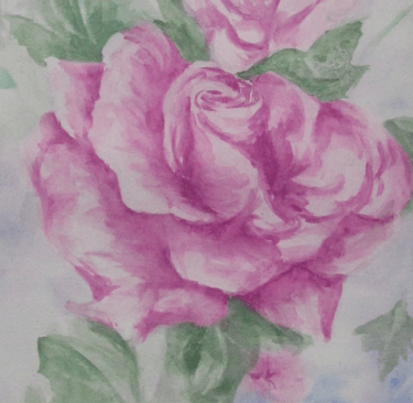
When it comes to the leaves, I have layered the green as I did the magenta and mostly the darkest shadow areas are underneath the roses to once again lift them out of the page. Some of the leaves are fading off into the soft focus of the initial wet-on-wet background, so that also helps to tie the two elements of the picture together.
I deliberately painted the main rose and the two rose buds in sharp focus and using the full depth of colour allowed by that single paint colour. The full blown rose between the main one and the rose buds is painted in a slightly paler set of tones although it is using the same colour, so it draws the sharp focus and soft focus elements together.
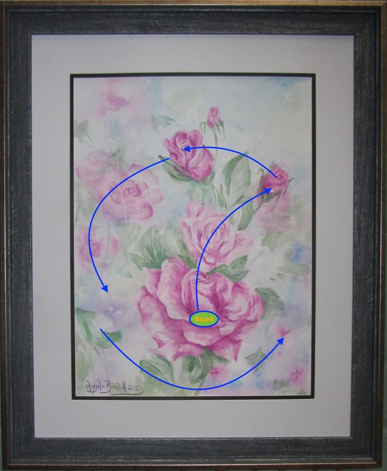
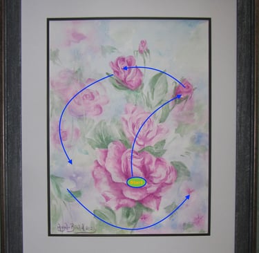
In the composition of the picture the main focal point is the big rose but I would not place that in the centre of the picture. To do so would draw the eye straight into the centre missing out on all the other areas of the picture . . . including the purple baboon!
As with most of my paintings and drawings, I use the simplified version of the centuries-old Golden Ratio (aka the Fibonacci sequence) which was simplified into the Golden Rectangle and now becomes the even more simplified use of thirds that even most camera lenses today show you just before you press the shutter button.
So, the main rose is in the centre but lower third with the main rose buds in the upper thirds. There is also a gentle curve coming through the roses starting with the main one at the bottom then using the petal highlights to lift the eye up to the centre rose and on to the two rose buds. The bigger of those buds is tilted left drawing your eye to the array of softer focus pink flowers and back down the page to the where we began. In composing a picture, you always need to look for the way of using colours and shapes to take the eye round the entire picture surface.
Golden yellow roses
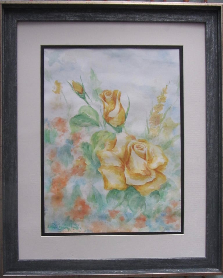
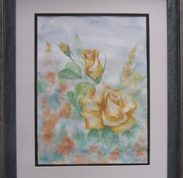
I changed the composition slightly, losing one of the bigger roses and centred the main one onto the junction between the lower horizontal third and the right hand vertical third. The eye is drawn straight up to the two rose buds and then tumbles down the page in the cascade of orange blooms to then circle round the base of the main rose and up the sword-like spike of yellow flowers to the right of the main rose. Once again, the eye is drawn right round the picture.
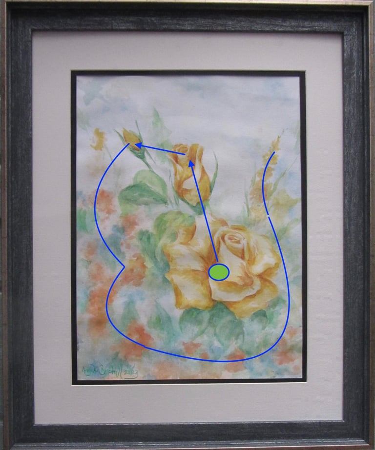
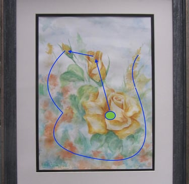
Despite doing the same wet-on-wet technique to begin with, I failed to conjure up a golden baboon but the results are still very pleasing.
Both pictures are 40 x 30 cm and mounted and framed they come out at 56 x 46cm. Both are on sale, so please message me if you are interested in buying either of them.
With the pink roses and purple baboon completed, I changed colour but stayed with the theme of roses and using the soft focus wet-on-wet background. Yellow is my other favourite colour so I chose a rich, golden yellow for the second painting’s roses but added some more orangey shades for background flowers.
Get in touch
Use the message box to drop me a line if you want to:
purchase my paintings or drawings;
discuss commissioning me to create a unique work of art especially for you;
have a question to be answered in a future Picture Perfect blog post;
join one of my face-to-face painting or drawing classes in West Lancashire or have private coaching online;
discuss a bespoke staff development event using art to encourage teamwork and leadership
Contacts
0044 77242 00779
youcandrawandpaint@gmail.com